Several layout patterns are often recommended to take advantage of how people scan or read through a design. 3 of the more common are the Gutenberg diagram, the z-pattern layout, and the f-pattern layout.
Each offers advice for where to place important information, but I think these patterns are often misunderstood and followed without thought to what they really describe.
I want to walk through the what and why of each pattern and then offer something else that gives you as a designer more control over where your viewer’s eye moves across your design.

The Gutenberg Diagram
The Gutenberg diagram describes a general pattern the eyes move through when looking at evenly distributed, hom*ogenous information. Read that last part again.
The pattern applies to text-heavy content. Think pages in a novel or a newspaper. The pattern isn’t meant o describe every possible design.
The Gutenberg diagram divides the layout into 4 quadrants.
- Primary optical area located in the top/left
- Strong fallow area located in the top/right
- Weak fallow area located in the bottom/left
- Terminal area located in the bottom/right
The pattern suggests that the eye will sweep across and down the page in a series of horizontal movements called axes of orientation. Each sweep starts a little further from the left edge and moves a little closer to the right edge. The overall movement is for the eye to travel from the primary area to the terminal area and this path is referred to as reading gravity.
Naturally this is for left to right reading languages and would be reversed for right to left reading languages.
The Gutenberg diagram suggests that the strong and weak fallow areas fall outside this reading gravity path and receive minimal attention unless emphasized visually in some way.
Important elements should be placed along the reading gravity path. For example placing logo or headline in the top/left, an image or some important content in the middle, and a call-to-action or contact information in the bottom right.
Designs that follow Gutenberg are said to be in harmony with natural reading gravity.
The claim is these designs improve reading rhythm, by being in harmony with the natural reading rhythm, as well as improving reading comprehension, but there’s little empirical evidence to support the claim.
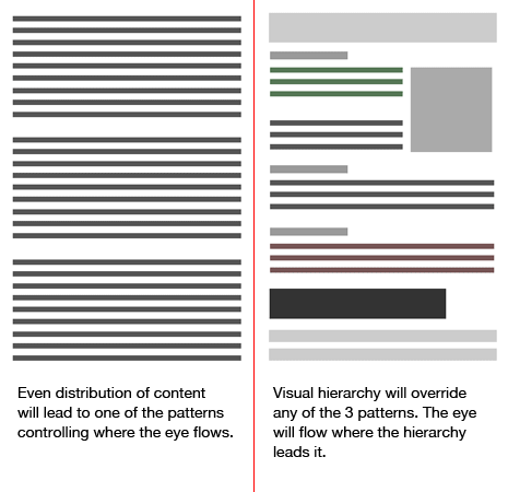
Again Gutenberg describes large blocks of text with little typographic hierarchy. As soon as you create a visual hierarchy the diagram no longer applies. Keep this in mind with the other patterns described below.

Z-Pattern Layout
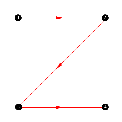
As you would expect the z-pattern layout follows the shape of the letter z. Readers will start in the top/left, move horizontally to the top/right and then diagonally to the bottom/right before finishing with another horizontal movement to the bottom/right.
The z-pattern is sometimes called a reverse-s-pattern, which might indicate more of a curved path as opposed to the hard angled path. Otherwise they’re basically the same thing.
The main difference with the Gutenberg diagram is that the z-pattern suggests viewers will pass through the two fallow areas. Otherwise they still start and end in the same places and still pass through the middle.
As with Gutenberg a designer would place the most important information along the pattern’s path.
The z-pattern is good for simple designs with a few key elements that need to be seen. Any storytelling aspect of the design would follow the path of the z.

Zig-Zag Pattern
We can extend this pattern a little by seeing it more as a series of z-movements instead of one big z-movement.
Common sense would dictate this is more realistic as the reader will continue to move to the right and then a little down and back to the left before starting another horizontal movement to the right again. It’s how we naturally read large blocks of text.
This series of z-movements is sometimes referred to as a zig-zag pattern. If we continue to add more zigs and zags to the pattern we ultimately end up with a series of near horizontal right and left movements as the diagonal portion of the z gets shallower and shallower.

Golden Triangle Pattern
The z-pattern also leads to what’s called a golden triangle pattern. If you take the first horizontal and first diagonal movement and then close the shape you end up with a right triangle whose right angle is the top/left corner.
This triangular area at the top of the page will be the area most seen and the pattern suggests your most important information needs to placed inside of it.

F-Pattern Layout
The f-pattern gets mentioned on the web and as you would expect it follows the shape of the letter F.
I think Jacob Nielsen first suggested the pattern after eye-tracking studies his company performed. What often gets lost in the f-pattern is that these original studies were done on text heavy designs and search results.
As with the other patterns the eye starts in the top/left, moves horizontally to the top/right and then comes back to the left edge before making another horizontal sweep to the right. This second sweep won’t extend as far as the first sweep.
Additional sweeps move less and less to the right and for the most part after the second major sweep the eye sticks close to the left edge as it moves downs.
The f-pattern suggests that:
- Important information should be placed across the top of the design where it will generally be read.
- Lesser information should be placed along the left edge of the design often in bullet points where little horizontal eye movement is required to take everything in.
- People don’t read online. They scan.
Unfortunately the pattern seems to get applied to everything online instead of only text-heavy content. If you look at Nielsen’s original heat maps below you’ll see the F is contained within the main content and doesn’t extend to the full design.
When applying the f-pattern think scanners and place content these scanners would most likely be interested in along the F. Place important information at the top and information designed to pull someone further into the page down the side.
However keep in mind that if someone scanning your page finds it interesting, they will read so you can place information in places outside the F for those people who will read.
Thoughts About All 3 Patterns
I’ve alluded to it a few times already, but it’s important to understand these patterns describe where the eye naturally goes when there’s a lack of hierarchy in the design. They describe natural patterns for evenly distributed and text-heavy content.
Unfortunately the patterns are often applied to designs where there is an existing visual hierarchy and for designs that include more than text.
The patterns are also more similar than their names imply. In all three a viewer starts in the top/left and moves to the right. In the Z and F patterns they perhaps move a little further to the right, but all still move to the right.
Both z-pattern and Gutenberg end in the same place and move through the middle. The reason the f-pattern doesn’t reach the end can be explained by.
- Having content that doesn’t fully interest and engage the reader. Sadly true of most online content.
- Writing with an inverted pyramid style, which expects to lose readers as they move down the page.
- People scanning to determine if they want to read more.
Odds are any visitor who finds your content absorbing will want to read more and break out of the f-pattern reaching the terminal area.
One last point is that as these patterns are discussed more it leads to more designs emphasizing the pattern. If you’re convinced your readers will follow one of these patterns, you’ll likely create designs that enhance that pattern. It leads to a chicken and egg scenario.

Pattern of Focal Points
The reason I keep coming back to the text-heavy thing is because as soon as you start giving your design elements different visual weights and create hierarchy and flow, the patterns above no longer apply and there’s only one pattern you need to understand, which is one you completely control.
It’s not so much a pattern as it is solid design principles, but since we’re talking patterns here I’ll give it a name.
The pattern of focal points says that people will first look at the most dominant element (the element or area with the greatest visual weight) on the page.
From there the eye will follow paths from the dominant element to other focal points in the design. The order will depend on the relative weights of these focal points as well as any visual cues indicating where to look next.
I often include Kandinsky’s Composition 8 (seen above) when talking about focal points, balance, and flow. While it’s art and not design, it’s an good example of all 3 principles. Your eye will get pulled in to the upper left and start to move from one point to the next.
The lines in the painting help direct your eye to the different focal points. I doubt your eye will follow an F or Z or reading gravity through the design. The painting should make it clear that creating hierarchy and flow overrides any of the patterns we’ve been talking about here.

Summary
While patterns like the Gutenberg diagram, the z-pattern, and the f-pattern layout suggest that there is a natural path the eye will take through a design, the reality is they refer only to designs dominated by large blocks of text with little to no hierarchy.
If that describes your design then any of these 3 patterns might suggest where to place important information. You might also want to consider these patterns for people scanning your design and place elements meant to pull people further in along their paths.
As soon as you begin adding elements of varying visual weight, the path the eye will take through your design is the one you create. You can choose to reinforce Gutenberg, F, or Z patterns if you want, but you aren’t limited by them.
It’s logical that in the absence of other visual cues people will start in the top/left and move across and then down the page. It’s how we’ve been taught to read. The key phrase though is “the absence of other visual cues.” When those cues are present they’ll always control the path the eye takes.
Instead of trying to force your design into one of the patterns described, decide instead what information you want the viewer to see and through a series of focal points and design flow lead their eyes through your hierarchy of information. That’s really the only pattern you need to use.
« Prev PostNext Post »
Download a free sample from my book, Design Fundamentals.
